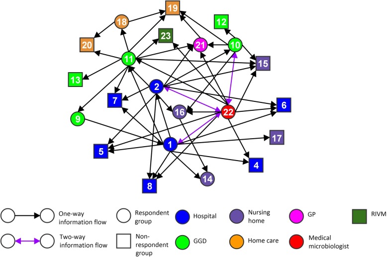
Fig. 1.
Social network visualization of indicated information flows during the outbreak in region A. Circles and squares indicate healthcare professions, subsequently healthcare professions included as respondents and healthcare professions not included as respondents. The numbers in the circles and squares correspond with the numbers of healthcare professions in Table 2 (except for number 23, which represents the RIVM as institution). The colours indicate the healthcare institutions in which the healthcare professionals operate. The direction of the arrows visualizes the information flow as indicated by the sender of the arrow. Purple arrows visualize reciprocated information flows

