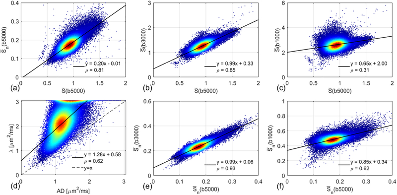
Figure 5.
Density scatter plots and Pearson correlations between the mean signals at different b-values using all the white matter voxels of the same subject shown in Figure 2. Red denotes higher density of points, and blue denotes lower density. The solid line indicates the result of linear least squares fitting. The dashed line in (d) is identity line (y = x).

