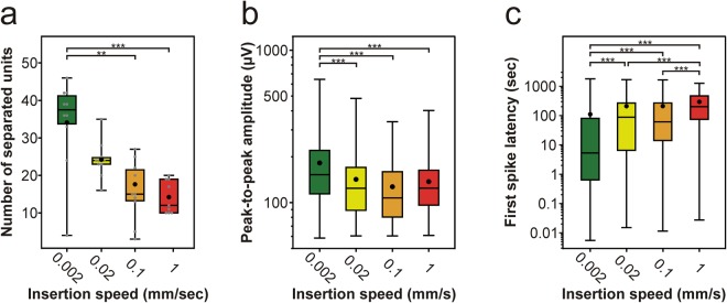
Figure 5.
Insertion speed-dependent difference in the properties of the recorded single-unit activity. (a–c) Box-and-whisker plots showing the distribution of the number of well-separated single unit clusters (a), the distribution of the peak-to-peak amplitude of spike waveforms (b), and the distribution of the first spike latencies (c) for each insertion speed (total number of well-separated neurons for each speed: 0.002 mm/s, n = 341; 0.02 mm/s, n = 242; 0.1 mm/s, n = 159; 1 mm/s, n = 128). On the box-and-whisker plots, the middle line indicates the median, while the boxes correspond to the 25th and 75th percentile. Whiskers mark the minimum and maximum values. The average is depicted with a black dot. Gray dots on panel (a) correspond to single unit yields obtained for individual penetrations. Data on panel (b) and (c) are plotted on a logarithmic scale. **p < 0.01; ***p < 0.001; Dunn’s post-hoc test with Bonferroni correction.

