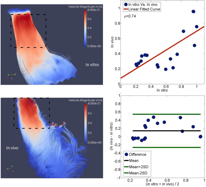
Figure 7.
Comparative analysis of the in vivo and in vitro flow fields. Streamlines color coded with velocity magnitudes at the peak systolic phase in vitro (top left) and in vivo (bottom left) (higher velocity magnitudes occur in the proximity of the RVOT, whereas the velocity magnitudes are comparatively lower at the RV subtricuspid region and the apex). Dashed lines represent the investigation domain where the statistical analysis has been performed. The linear regression analysis between velocity magnitude normalized by peak velocity magnitude in vivo and in vitro (top right) and Bland-Altman analysis between velocity magnitude normalized by peak velocity magnitude in vivo and in vitro (bottom right). Filled blue circles represent a different time-point in the cardiac cycle.

