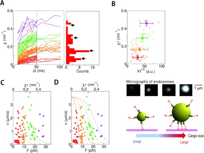
FIGURE 4:
Measurement of χ for anterogradely transported endosomes in axon. (A) The traces of χ plotted against Δt for anterograde endosomes (n = 79). They were classified into four clusters by k-means clustering (indicated with different colors; see Materials and Methods for the details). The distribution of χ* values (χ at Δt = 51 ms) is shown as a histogram. The positions of the cluster centers are indicated by arrows. (B) The fluctuation χ* is plotted against the square root of fluorescence intensity (FI), which is a proxy for the radius of the endosome (middle panel). The color of each data point is the same as in the left panels in A, which reflects the number of FPUs. The average and the SD for each cluster are shown with square symbols with error bars. There was a weak correlation between χ* and (FI)1/2 (r = 0.40), suggesting a tendency toward the larger endosomes experiencing a larger force with a greater number of FPUs (schema on the bottom). (C, D) For each endosome, the velocity is plotted against χ*. The data points (circles) are plotted with the same colors as in A. The curves are the results of in vitro measurements of kinesin-1 (Schnitzer et al., 2000) without adjustment of the maximum velocity (C) and after adjustment of the maximum velocity (D).

