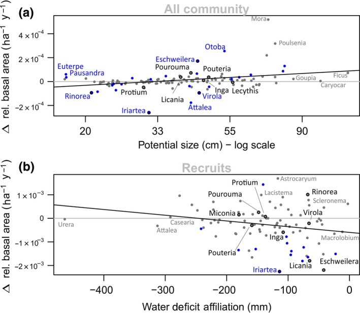
Figure 5.

Floristic changes behind the detected functional shifts. The y‐axes represent mean linear slopes of plot level genera relative abundance across the Amazon in terms of number of individuals or basal area as a function of time, with each plots’ contribution weighted by the square root of plot area and monitoring period. Grey horizontal lines indicate zero change. The x‐axes represent genus‐level traits. (a) Trends in relative basal area within the whole community versus potential size (cm), plotted in the log scale to facilitate visualization; (b) trends in stem relative abundance within the recruits versus water deficit affiliation (mm). Genera that show significant trends in abundance across the basin are shown in blue. Black contour marks the 10 most abundant genera in terms of number of stems
