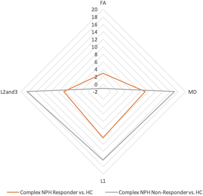
Figure 3.

DTI profiles for complex NPH vs. healthy controls—radar graphs represent percentage (%) differences between pre-intervention patients and controls, differentiated by their post-intervention responses. The larger the DTI radar graph, the greater the differences between patients and controls. This graph demonstrates that compared to healthy controls, DTI profiles for complex NPH responders were more preserved compared to non-responders at baseline.
