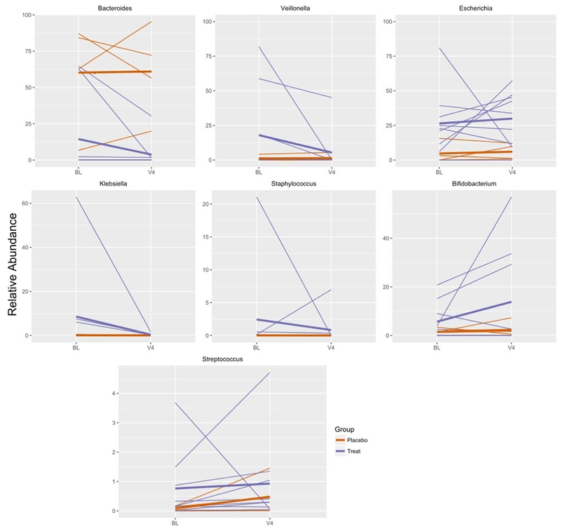
Figure 3:
Changes in relative abundance of prominent genera over time in infants treated (blue) and infants give a placebo (orange). Each thin line represents a single infant. The mean for treated and placebo infants is represented by bold lines of the corresponding color. Only infants that had baseline (BL) and 4th visit (V4) specimens are represented in the graph.

