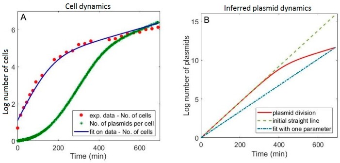
Figure 4.
Population (cell and plasmid) dynamics. (A) Experimentally measured log number of cells vs. time (red dots) fitted by equation (12) (blue curve). The average number of plasmids per cell in time (green crosses), is shown on the same graph to allow comparison; (B) Solid red curve corresponds to the plasmid dynamics from Equation (13), described by three parameters (in analogy to the experimentally observed cell dynamics). Green dashed line represents the plasmid dynamics generated by the constant plasmid division rate, which corresponds to extrapolating the early part of the red curve to the end of the experiment. Blue dash-dotted line also corresponds to the assumption of constant plasmid division rate, where the division rate is taken as a free parameter obtained by fitting the model to R and M dynamics data.

