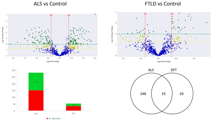
Figure 1.
The two volcano plots are the graphical representation of the quantitative comparison performed in the present study. Each dot represents a protein; in blue unchanged proteins and in yellow (−log10 p value > 1.3) and green (−log10 p value > 2) the ones significantly dysregulated in each analysis. The first volcano plot shows the ALS vs control comparison and the second one shows the FTLD-U vs. control comparison. The Bar plot describes the number of significantly dysregulated proteins (up-regulated: red. Down-regulated: green). The Venn diagram illustrates the number of significantly dysregulated proteins in each disease and the observed overlap across comparisons.

