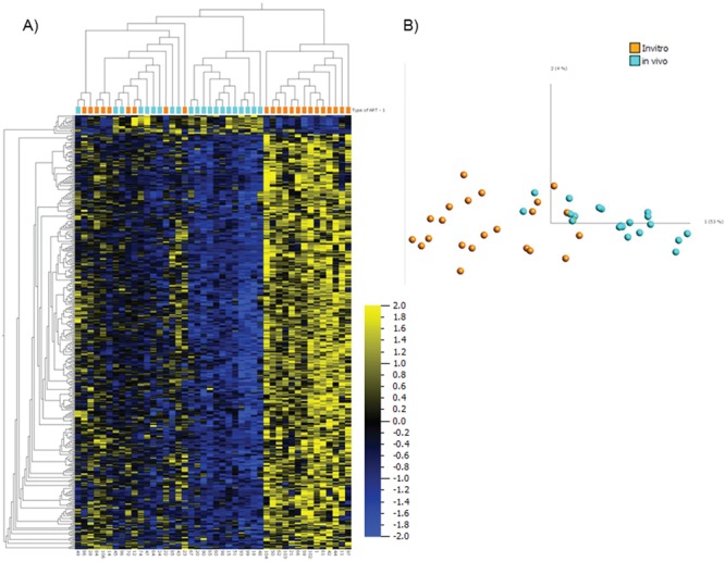
Figure 5.

Comparison between in vivo and in vitro groups of ART. Heatmap (A) and PCA graph (B) using the discriminating 436 variables between 21 in vivo and 23 in vitro samples at q = 0.05. Orange color represents in vitro group and turquoise color represents in vivo group. For the heatmap, data are normalized for visualization (mean = 0, variance = 1).
