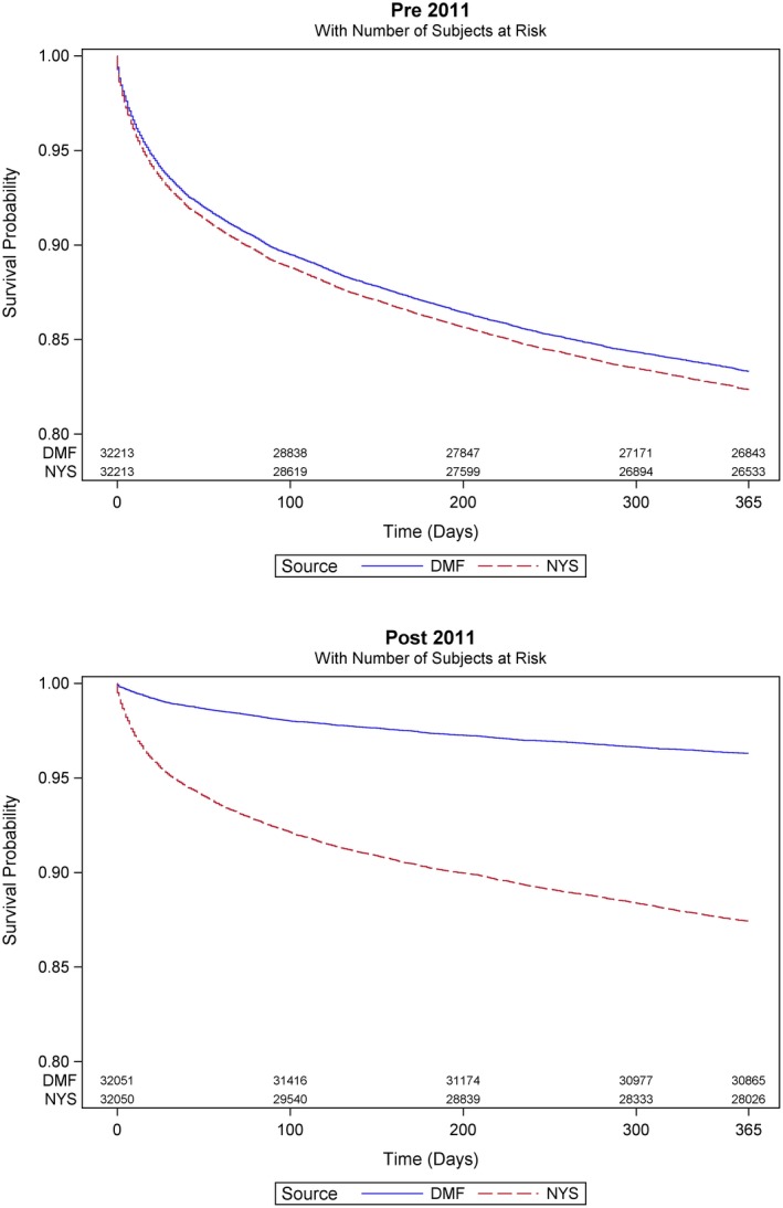
Figure 2.

Kaplan‐Meier 1‐year survival curves for pre‐2011 (top panel) and post‐2011 (bottom panel). DMF shown in blue, and New York State vital statistics death records (NYS) in red. Post‐2011 the curves diverge and the DMF overestimates survival [Color figure can be viewed at wileyonlinelibrary.com]
