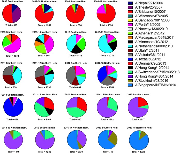
FIG 6.
Frequencies of influenza HA clusters in consecutive seasons between 2007 and 2016. Influenza HA sequences posted in GISAID databases were aligned and clustered into families per Northern and Southern Hemisphere seasons. The clusters in each pie chart that differ by 5% in amino acids in the HA sequence are depicted by a different color and slice of the pie chart. Each influenza season for the Northern and Southern Hemispheres from 2007 to 2017 to 2018 is depicted. Representative influenza viruses from each cluster in the pie charts are listed and match the color of the pie charts.

