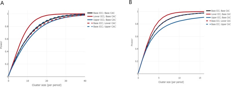
Figure 3.
(A) Power curve for the first primary outcome, proportion of kidneys that are transplanted on first offer. The curves show the increase in power as the cluster size increases, for 20 clusters, 5 steps, 4 clusters crossing over at each step and the proportion under control and intervention of 28% and 39%, respectively. The black curve shows the power for the base values of within-period intracluster correlation (WP-ICC) and cluster autocorrelation (CAC) (0.03 and 0.92, respectively), and the remaining curves show for lower and upper levels of the WP-ICC (0 and 0.08, respectively) and CAC (0.74 and 1, respectively). (B) Power curve for the second primary outcome estimated glomerular filtration rate measured at 12 months after transplant. The curves show the increase in power as the cluster size increases, for 20 clusters, 5 steps, 4 clusters crossing over at each step and the mean difference of 6 and SD of 16.06. The black curve shows the power for the base values of WP-ICC and CAC (0.06 and 0.08, respectively), and the remaining curves show for lower and upper levels of the WP-ICC (0.01 and 0.11, respectively) and CAC (0.06 and 0.10, respectively).

