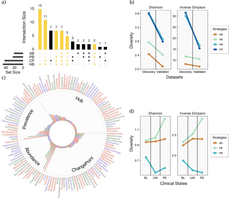
Fig. 2.
The relationships between the different key taxa selection strategies. a An UpSetR visualization of interactions between sets of key taxa identified by the four different key taxa selection strategies within the discovery data set. The grid along the bottom is used to identify interaction sets (analogous to a Venn diagram). A heavily colored yellow or black dot in the grid indicates that the key taxa detection strategy showed on the left has contributed to the interaction set showed on the top. The number of key taxa identified by each strategy and the size of each interaction set are represented, respectively, by horizontal bars on the left and vertical bars on the top. The interaction sets to which the HB strategy has contributed are shown in yellow (AB: abundance-based, PB: prevalence-based, HB: hub-based, and CP: change-point standard). b Analysis of diversity for the three key taxa identification strategies using Shannon and inverse Simpson diversity for the discovery and validations data sets. c All the key taxa identified in the discovery data set stratified by the key taxa selection strategy. Taxa are color-coded based on their mode of metabolism (green, blue, and red for aerobic, facultative, and anaerobic microbes, respectively). The bar radiation from the center of the chart indicates the relative frequency of each key taxon among all the patients in the data set. d Shannon and inverse Simpson diversity plots showing the amount of diversity associated with each of the three clinical states: baseline (BL), unwell (UW), and pulmonary exacerbation (PE)

