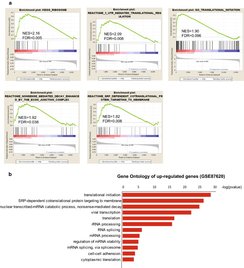
Fig. 3.
GSEA analysis of MADNT expression data. a Prominent transcriptional patterns in NPs. The diagram showed GSEA plots for 5 pathways recapitulating the main difference between NPs and PPs (NPs were shown at left-hand side in GSEA plot, PPs right-hand side). The vertical axis in the upper graph indicates Enrichment Score (ES) for genes in each gene set. The barcode plot indicates the position of genes in each gene set. Red and blue colors represent positive and negative Pearson correlation with HIV progression. b Functional annotation of up regulated genes with FDR less than 0.05 in the validating set (GSE87620)

