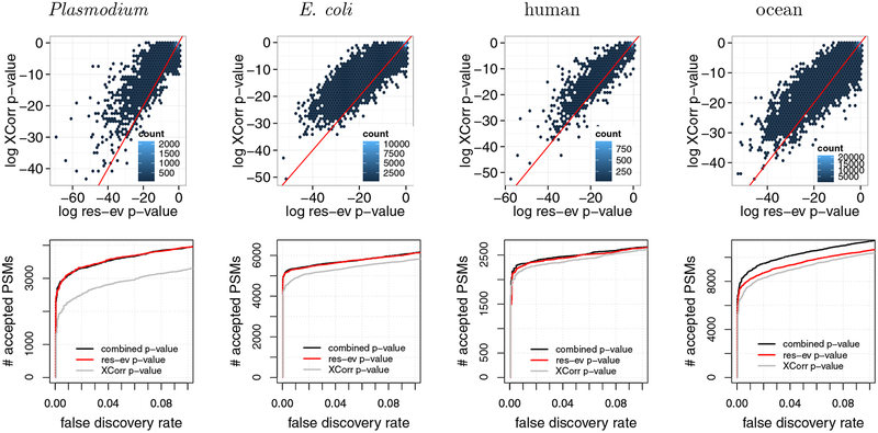
Figure 6:
Combining XCorr and res-ev. (Top row) Each panel plots, for a specified dataset, a density plot of p-values from XCorr (y-axis) versus res-ev (x-axis). The points are binned into hexagons, and the color of each hexagon represents the number of points within each bin. The red line represents y = x. (Bottom row) Each panel plots the number of PSMs accepted as a function of FDR threshold, for three different database search methods: XCorr p-value, res-ev p-value, and combined p-value.

