
Figure 1.
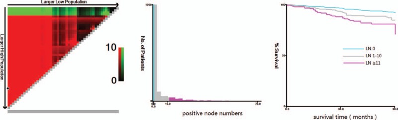
X-tile analysis of survival data from the SEER registry. X-tile analysis was done on patient data from the SEER registry, equally divided into training and validation sets. X-tile plots of training sets are shown in the left panels, with plots of matched validation sets shown in the smaller inset. The plot shows the χ2 log-rank values produced when dividing the cohort with two cut-points, producing high, middle, and low subsets. The optimal cut-point highlighted by the black circle in the left panels is shown on a histogram of the entire cohort (middle panels) and a Kaplan–Meier plot (right panels). P values were determined by using the cut-point defined in the training set and applying it to the validation set. Figures show positive node numbers divided at the optimal cut-point (1 and 11, χ2 = 25.10, P < .001). SEER = Surveillance, Epidemiology, and End Results.