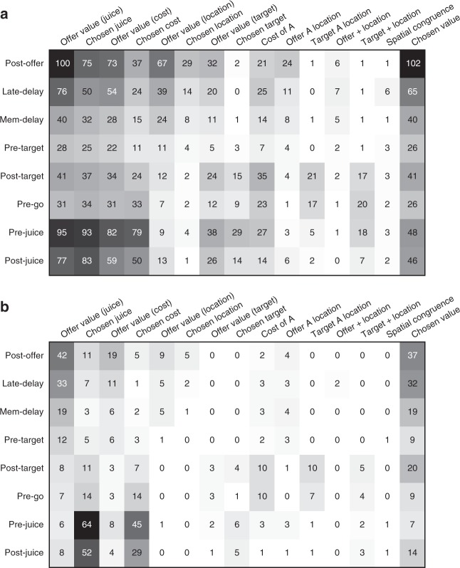
Fig. 4.
Population summary of linear regressions (all time windows). a Explained responses. Row and columns represent time windows and variables, respectively. In each location, the number indicates the number of responses explained by the corresponding variable in that time window. For example, in the post-offer time window, the variable offer value (juice) explained 100 responses. The same numbers are also represented in gray scale. Note that each response could be explained by more than one variable and thus could contribute to multiple bins in this panel. b Best fit. In each location, the number indicates the number of responses for which the corresponding variable provided the best fit (highest R2). For example, in the post-offer time window, the variable offer value (juice) provided the best fit for 42 responses. The numerical values are also represented in gray scale. In this plot, each response contributes to at most one bin. Qualitatively, offer value (juice), and chosen value seem to be the dominant variables in early time windows. Conversely, chosen juice and chosen cost seem to be the dominant variables in late time windows. The variable chosen value is present througout the trial

