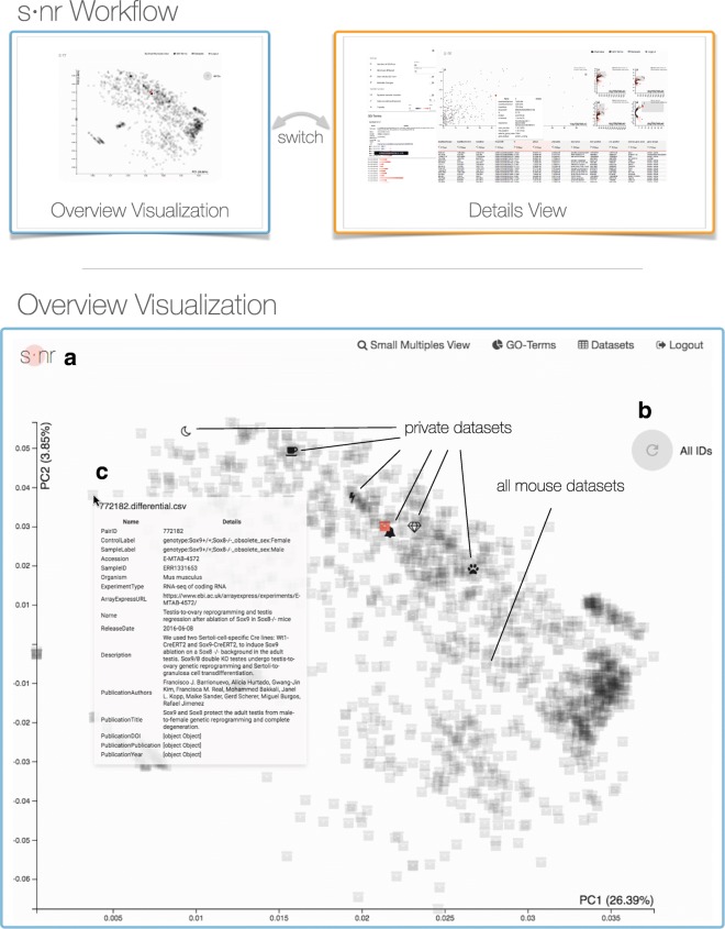
Fig. 2.
Workflow of s ·nr and detailed overview visualization showing a principal component analysis (PCA) of 1543 differential RNA-Seq expression mouse profiles. The s ·nr workflow consists of the overview visualization view that is used to select datasets based on similarity. The user can further investigate the selected data sets using the details view. Mean as an iterative analysis loop the user can always go back to the overview visualization to adjust the selection of potentially interesting data. We derived the data depicted in the overview visualization from ArrayExpress, processed it using QuickNGS, and provide the result with this paper. The analysis starts with the overview plot showing the first two PCAs of the p-values of all genes of public and private data sets. Public data sets are uniformly assigned the box icon and a higher transparency to facilitate identification of the user’s data. Data with similar p-values cluster together. a The dot of the s ·nr logo emits a fading circle when data is fetched from the server. b The PCA displayed is based on data for all genes. On brushing data sets in the details view, the user can narrow down the genes of interest and trigger a new PCA calculation based on the selected group of genes. c Mouse-over shows meta data of the data set. Clicking on a data set icon fetches its data and passes it to the details view. Icons of downloaded data are rendered orange, data sets flash upon loading

