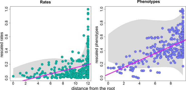
Fig 2.
Trend (left) and drift (right) regressions. The green and blue dots represent the actual distribution of rates and phenotypes (respectively), obtained after applying a trend to the rate and a drift to the phenotypes, as illustrated in Fig 1. The gray shaded area represents the distribution of values (either rates, left, or phenotypes, right) generated under the Brownian motion model for the same tree. Notice that both rates and phenotypes are rescaled to the 0–1 range. Rates are logged before running the trend regression.

