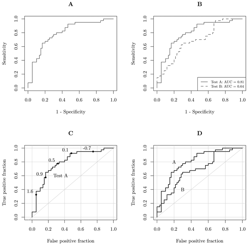
Figure 1:
Illustration of design choices in plotting ROC curves. Panel A shows a sparse ROC curve, with no design additions inside the plotting region. The plot results in more white space than anything else. It is difficult to accurately determine values without reference lines. Panel B shows a plot comparing 2 curves, with different line types and a legend. AUC values are also given in the legend. Panels C and D add grid lines, diagonal reference lines, and direct labels.

