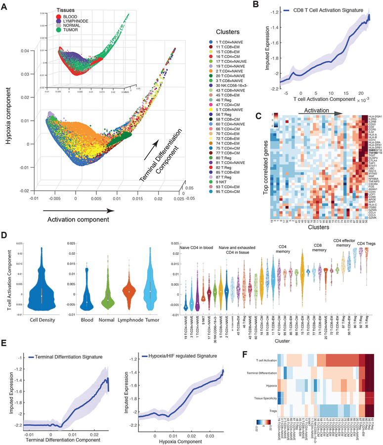
Figure 4:
Detailed Characterization of T Cells
(A) Visualization of all T cells using first three diffusion components (two uninformative components denoting isolated clusters were removed). Each dot represents a cell colored by cluster, and by tissue type in insert. The main trajectories are indicated with arrows and annotated with the signature most correlated with each component. See Figure S4D for additional components.
(B) Traceplot of CD8 T cell activation signature (defined as mean expression across genes in signature in Table S4) for all T cells along activation component. Cells are projected along the component (x-axis), and the blue line indicates the moving average of signature expression, using a sliding window of length equal to 5% of total number of T cells; shaded area displays standard error.
(C) Heatmap showing expression of immune-related genes with the largest positive correlations with activation component, averaged per cluster and z-score standardized across clusters; columns (clusters) are ordered by mean projection along the component. See Figure S4 for additional components.
(D) Violin plot showing the density of all T-cells (left), T cells in individual tissues (middle), and in individual clusters (right), along activation component. Number of dots inside each violin are proportional to number of cells.
(E) Trace-plots (as in B) of (left) exhaustion/terminal differentiation signature along second component and (right) hypoxia signature along third component. Signatures are presented in Table S4.
(F) Heatmap of cells projected on each diffusion component (rows) averaged by cluster (columns).

