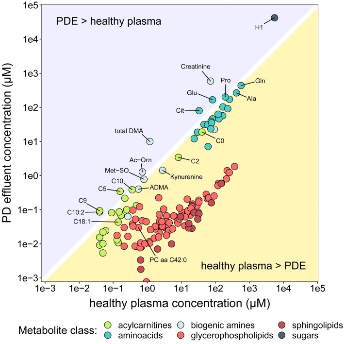
FIGURE 4.
Comparison of metabolite concentrations in PD effluent and healthy plasma. The y-axis (log scale) shows mean concentrations of PD effluent metabolites. The x-axis (log-scale) shows mean concentrations of plasma metabolites in 911 healthy individuals Goek et al. (2013). Only metabolites reported in the plasma dataset are shown (n = 140), colored by substance class.

