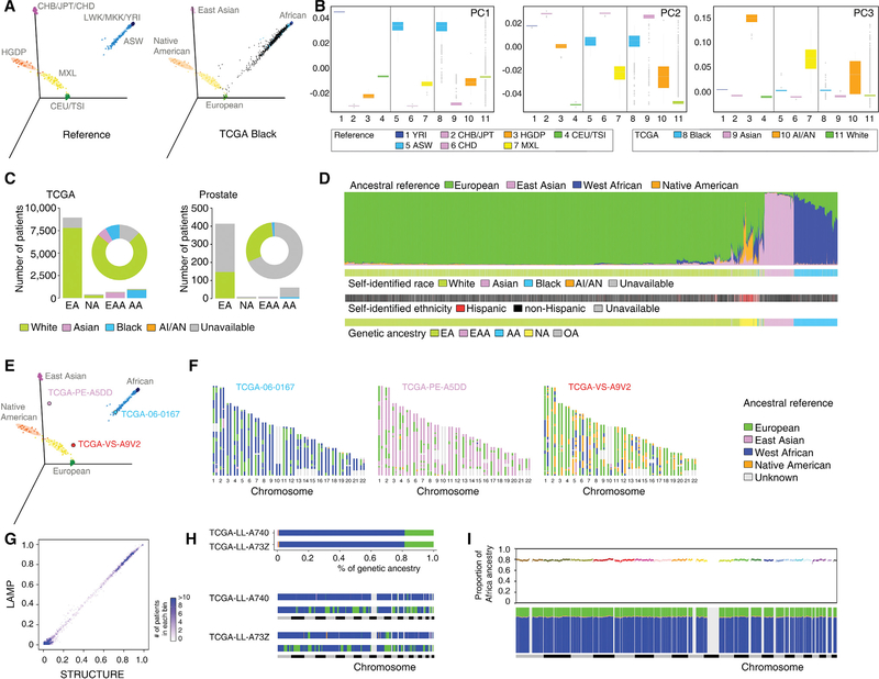
Figure 1. Estimation of Genetic Ancestry across TCGA.
(A) Three-dimensional visualization of genetic variation of individuals from the HapMap and HGDP reference populations (left) or self-identified Black patients of TCGA (right) on the first three principal components (PCs) calculated by EIGENSTRAT. The ellipse defines the 95% confidence interval for each genetically related group.
(B) Genetic variation on each PC stratified by reference populations and TCGA self-identified racial identity. Reference populations were selected and classified according to geographical location and genetic origin. Boxplot lines reflect lower quartile, median, and upper quartile of PC scores. Whiskers extend 1.5 times the interquartile range from the upper and lower quartiles, with points outside representing outliers.
(C) Bar plot showing the numbers of TCGA patients categorized into each of the four genetic ancestry groups (EA, NA, EAA, and AA) by EIGENSTRAT across the TCGA cohort (left) and in the prostate cancer cohort (right). SIRE information is color-coded by green (White), pink (Asian), blue (Black), orange (AI/AN), and gray (unavailable). The proportion of SIRE is also represented with a circle plot.
(D) Individual ancestry of TCGA patients inferred by STRUCTURE. Each color represents one of the ancestry reference groups. Each patient is represented by a column partitioned into different colors corresponding to the genetic ancestry composition. Patients are ordered following a hierarchical clustering by Ward’s methods on distance matrix calculated as cosine dissimilarity of genetic composition. SIRE and genetic ancestry categorization as estimated by EIGENSTRAT for each patient are shown in the same order at the bottom.
(E) Three-dimensional visualization of reference populations with three patients (TCGA-06–0167, TCGA-PE-A5DD, and TCGA-VS-A9V2) used as examples for genetic ancestry (AA, EAA, and NA, respectively).
(F) Local ancestry across SNPs on 22 autosomes inferred by LAMP for these three patients. Each patient was treated as a diploid admixed genome. The colors represent ancestral reference groups, and light gray marks genomic regions unassigned because they are missing from SNPs shared by reference populations.
(G) Comparison of the percent of West African ancestry inferred from LAMP (based on distribution of local ancestry) versus STRUCTURE. TCGA patients are grouped into bins, each of which represents an interval of 1% range. The intensity of a bin represents the number of patients in the given interval group.
(H) Global (top) and local ancestry (bottom) of two unrelated admixed AA patients. To visualize local ancestry, SNPs on 22 autosomes are ordered according to genomic location. Each color represents one of the ancestry reference groups. Same color code as in (F).
(I) Genome-wide distribution of average ancestry proportion at each ancestral segment in AA patients of TCGA. Top, average proportion of West African ancestry plotted against genomic position along the 22 autosomal chromosomes (colors indicate different chromosomes). Bottom, average contribution from the four ancestral groups. Each color represents one of the ancestry reference groups. Same color code as in (F).
See also Figures S1–S3; Tables S1 and S2.

