Fig. 3.
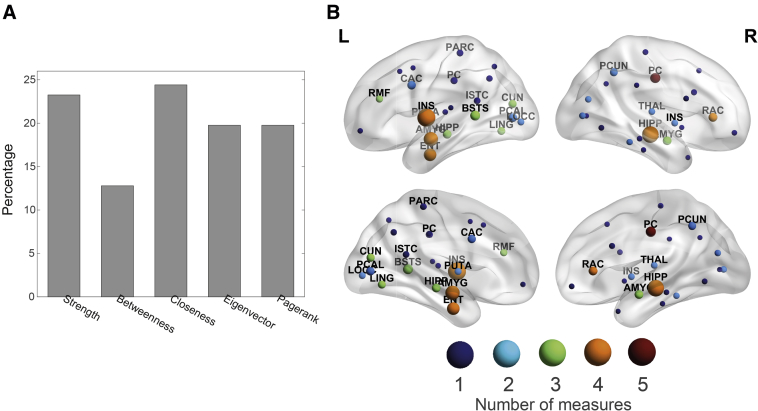
Identification of relevant centrality measures and brain regions. (A) A bar chart representing the proportion of each centrality measure that was included in the final set of selected features. (B) Brain map representing the most predictive regions to classify between dementia and healthy control. Lateral and medial views are shown on the top and bottom rows, respectively. The node size is proportional to its relative importance, which was computed from the feature ranking. Node color encodes the number of centrality measures included in the final set of features referring to that specific region. Abbreviations are shown for those regions having a relative importance above the median, and their definitions are given in Supplementary Table 1.

