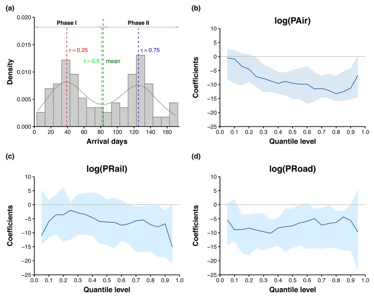
Figure 5.
Quantile process regression of arrival days in 115 prefectures. In (a) the density plot of arrival days, the red, green, and blue vertical lines indicate, respectively, the = 0.25, 0.50, and 0.75 quantiles of arrival days, whereas the dark green vertical line indicates the mean arrival days. In quantile process plots for log-transformed air (b), rail (c), and road (d) passenger volumes, the blue curves and shaded areas represent the quantile regression coefficients and 95% confidence intervals.

