
Figure 3.
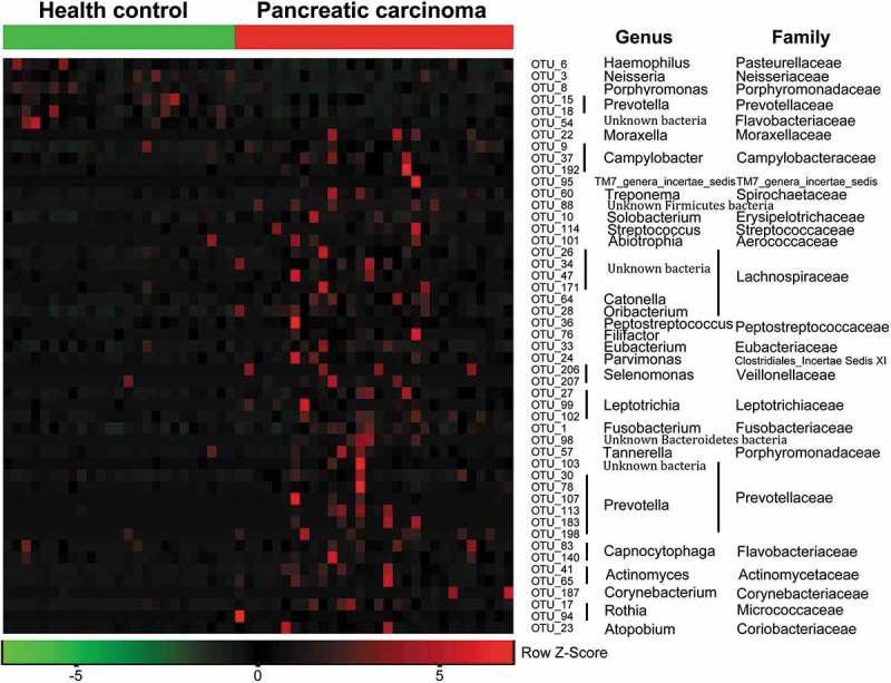
Heat maps of the relative abundances of the discriminatory OTUs that drive the differences between PCT and HT.
For each sample, the columns show the relative abundance data of the discriminatory OTUs listed to the right of the figure. The relative abundance of each OTU was used to plot the heat map (blue, low abundance; red, high abundance). The group information was shown above the plot: healthy controls on the left with green line, PC patients on the right with red line. Each row represents one OTU. The family and genus of each key OTU are noted to the right of the figure. The top six OTUs were found enriched in healthy controls, and the rest OTUs enriched in pancreatic cancer patients. PCT, pancreatic cancer patients tongue coat; HT, healthy subjects tongue coat.