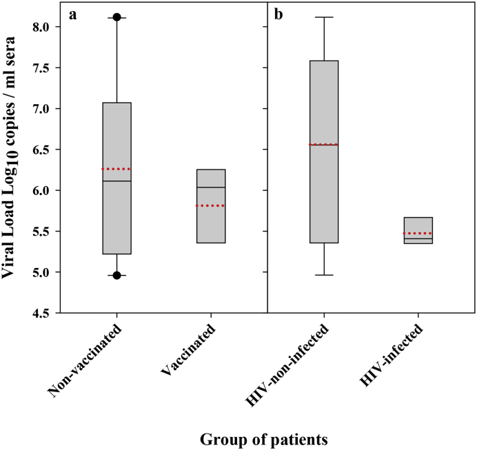
Fig. 3.
HAV viral loads. (a) Boxplot of the average virus load in sera from the non-vaccinated and vaccinated groups. (b) Boxplot of the average virus load in sera from HIV-non-infected and HIV-infected groups. Bottom and upper limits of the boxes represent the 25th and 75th percentiles, respectively. When present (n > 9), bottom and upper whiskers represent 10th and 90th percentiles, respectively. The median is represented by a solid black line and the average as a dotted red line.

