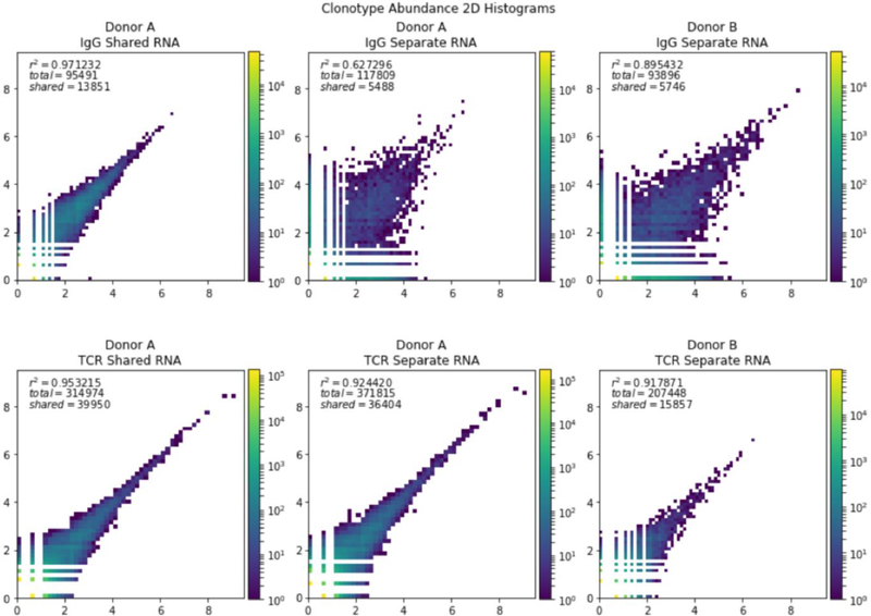
Figure 2. Comparison of the abundance of clonotypes in samples.
The log of the abundance of the clonotypes from different libraries was plotted as a heat map. Top row: Comparison of two samples if IgG. Bottom row: Comparison of two samples of TCRbeta. Left column: Two libraries generated from the same RNA pool. Middle column: Two libraries generated from different pools of RNA from donor A. Right column: Two libraries generated from different RNA pools of donor B.

