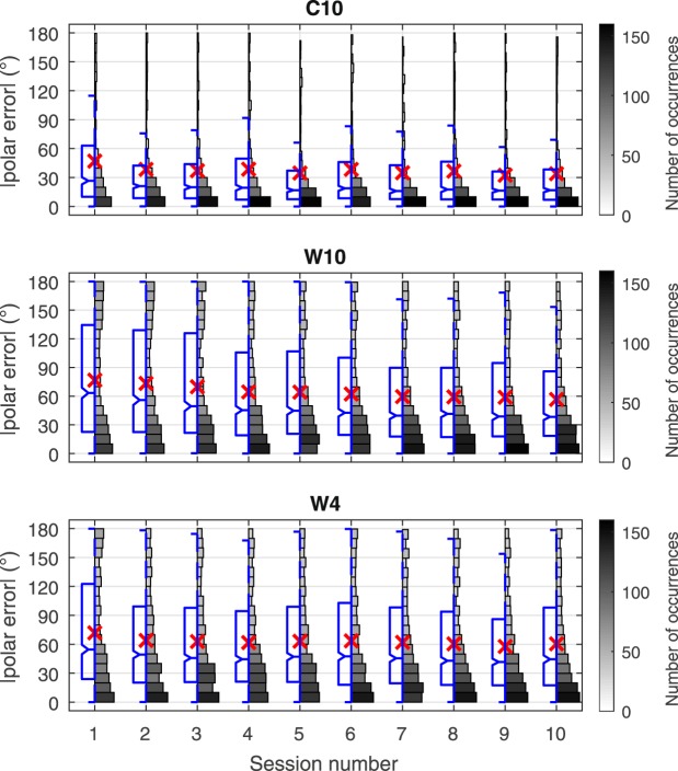
Figure 3.
Polar angle error evolution over the 10 sessions for the three participant groups. Split boxplot-histogram of the magnitude of polar error by session, results for all subjects combined by group. Boxplot and angular error axis scales (left); mean values (×); histogram value gray-scale maps provide numerical data references for number of occurrences of responses represented by the histograms (right). Boxplot diagrams indicate the 25th percentile (Q1), median (Q2, comparison interval notch with significance α = 5%), and 75th percentile (Q3), with data extent whiskers spanning the lowest and highest data points in the range Q1 − 1.5 × (Q3 − Q1) to Q3 + 1.5 × (Q3 − Q1).

