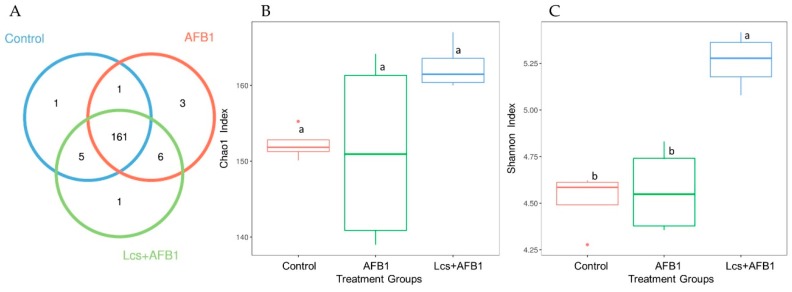
Figure 3.
OTU Venn diagram (A) and alpha diversity indices (Chao1; (B) and Shannon index: (C)). The circles of different colors in the Venn diagram represent different treatment groups, and the numbers in the figure represent the numbers of OTUs unique or common to each treatment group. In the petal diagram, each petal represents a treatment group. The numbers on the petals represent the number of OTUs unique to the treatment group, and the white circle in the middle represents the number of OTUs shared by all groups. The chao1 index showed boxplot of each group. The X-axis indicates the names of the groups and Y-axis indicates the Chao 1 index. Each box diagram shows the minimum, first quartile, medium, third quartile and maximum values of the chao1 index of the corresponding treatment groups. Graph C is the Shannon index boxplot of each group. Means between different treatment groups with different superscript letters (a and b) are significantly different (p < 0.05).

