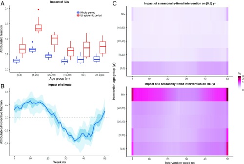
Fig. 3.
Predicted impact of different interventions. (A) Fraction of IPDs attributable to ILIs according to age (x axis), calculated during the whole study period (blue boxplots) or the ILI epidemic periods (defined as ±6 wk around the ILI peak week every year, red boxplots). For every epidemiological year, ILIs were set to 0 in a given age group; the resulting number of IPDs in that age group during that year was calculated and compared with that of the base model (with ILIs). The attributable fraction represents the relative decrease (compared with the base model) in the number of IPDs. Each boxplot shows the year-to-year variation in the attributable fraction. (B) Relative excess of IPDs due to climate, according to week number (x axis). For every epidemiological year, the climate covariates of the best model were set to 0; the resulting overall number of IPDs during that year was calculated and compared with that of the base model. The fraction represents the relative decrease (if positive) or increase (if negative) in the number of IPDs, compared with the base model. For every week number, year-to-year variability is summarized by the median (blue line), the interquartile range (dark blue ribbon), and the range (blue ribbon). (C) Predicted impact of a seasonally timed intervention. We simulated the impact of reducing the contacts of a target age group (y axis) during a target week number (x axis) throughout the study period. The heatmap shows the predicted relative decrease (in %) of IPDs in [0, 5) y (Top) and 60+ y (Bottom), the two age groups most at risk for IPDs. For visual clarity, the color scale is square-root transformed. See SI Appendix, Supplementary Results for complete details of the simulation protocol and SI Appendix, Fig. S9, showing the predicted impact in all of the age groups.

