Figure 4.
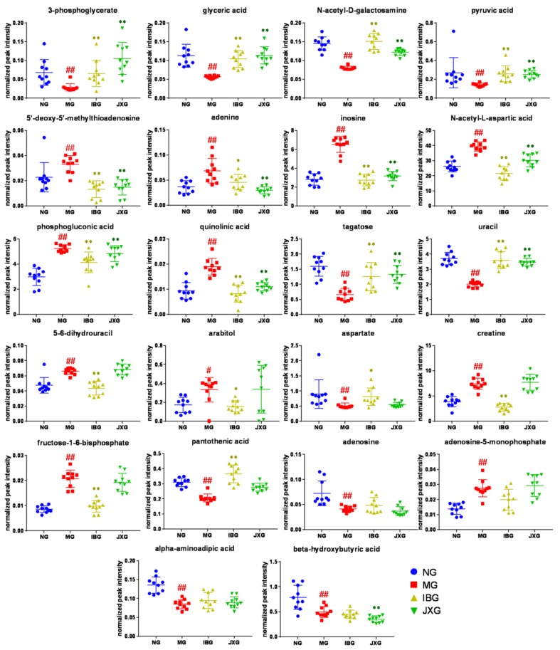
Scatter plots of significantly changed metabolites’ normalized peak intensity in rat brain samples. The x-axis shows the specific metabolite’s normalized peak intensity, and each scatter represents a rat brain sample.  represents brain samples of NG,
  represents brain samples of MG,
  represents brain samples of IBG, and
  represents brain samples of JXG. The scatter plots show the mean and SD of the metabolites. # p < 0.05, ## p < 0.01, vs. NG; * p < 0.05, ** p < 0.01, vs. MG.

