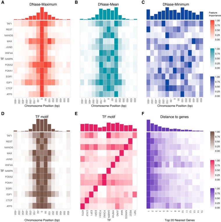
Figure 5.
The spatial distributions of DNase-based, sequence-based, and distance-to-gene feature importance. The relative feature importance heat maps of DNase-based (A) “maximum,” (B) “mean,” and (C) “minimum” features display common and TF-specific distributions in the vicinity of the TF binding site. For each feature, the original feature importance values were normalized to the range [0,1], and more important bins are shown in a darker color. The x-axis represents the relative distance to the center of a binding site in bp units, and each bin represents a 200-bp genomic interval. The corresponding accumulated feature importance is shown in histograms above the heat maps. Of note, the symmetric binding pattern is not clearly shown in C, the “DNase-minimum” feature, due to the relatively low values of the minimum signal. However, when we use the “ΔDNase-Minimum” feature (Supplemental Fig. S13C) to capture the difference across cell types, the pattern emerges. (D) Similarly, the relative feature importance of sequence-based features calculated using the motif of query TF itself. (E) The feature importance heat map when we consider the interdependency between different TFs (e.g., using the motif of one TF to predict another TF). (F) The importance heat map of the top 15 closest distances to genes.

