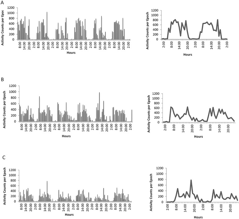
Figure 3.
Representation of the raw activity data (panels on the left) indicating the activity level (vertical black bars) throughout two consecutive days and double plots of the average 24-h activity level on solid line (panels on the right) of (A) a healthy subject; and (B and C) diabetic subjects both showing low rhythm amplitude, and high fragmentation.

