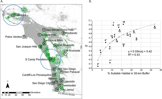
Figure 3.
(A) Map of mean center points for 18 regional aggregations overlaid on suitable habitat (green). Black circles represent 5-km buffers. Two examples of 30-km buffers are shown as blue circles around Ventura and South Camp Pendleton. Ocean area was excluded from calculations of suitable habitat availability. (B) Relationship between allelic richness (Ar) and percent suitable habitat of total land area within 30-km buffers. Data points are shown in black with aggregation numbers as in Panel A and Table 2. Model predictions are shown in grey. We found a statistically significant positive logarithmic relationship.

