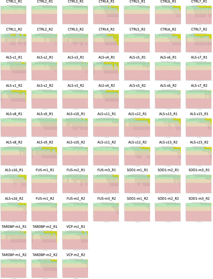
Figure 1. Quality assessment FASTQ data.
Quality assessment of raw FASTQ sequence data for paired end and left (sample_name_R1) and right reads (sample_name_R2). Box and whisker plots demonstrate the distribution of per base quality for each left and right read position read for each of the analyzed samples. Mean value is indicated by the blue line and the yellow box represents the interquartile range (25–75%) with the lower and upper whiskers represent the 10 and 90% points, respectively. Plots were generated by FastQC program (see Code Availability 1).

