. 2019 Feb 5;8:e40032. doi: 10.7554/eLife.40032

Figure 3. Allowing simulated bacteria to interconvert between pioneer and non-pioneer behavior recapitulates the non-circular phenotype of experimental foci.

(A) On the left nine panels, micrographs show nuclei (Hoechst, blue) and intracellular bacteria (mTagRFP, red). Green lines, which serve as an approximation of host cell boundaries, depict the Voronoi tessellation of the centroids of the host nuclei. White arrows track a single pioneer and its two daughters through time. Start time (leftmost panel) refers to 1255 min post-infection. The right panel shows nuclei (Hoechst, blue) and the pioneer path throughout 180 min. Dots indicate the position of the pioneer at a given time point. Shades of red depict progression of time. Black arrow indicates start position. Orange arrows indicate the location and time of two bacterial replication events. (B) The left three panels depict three time steps of a stochastic simulation where Dslow = 1, Dfast = 100, P = 0.10, and k = 1. Each simulated bacterium is depicted by a data point. Green boundaries fully enclose all data points. On the fourth panel, boundaries (shades of green) depict the progression of a simulated focus boundaries at nine evenly-spaced time steps. (C) Images depicting 105 simulated bacteria at step 800 of stochastic simulations where Dslow = 1, Dfast = 100, k = 1, and probability of becoming a pioneer is depicted in cyan. Green boundaries fully enclose all data points. Circular dashed lines represent the smallest circles that fully enclose the green boundaries. (D) Data quantifying the circularity of experimental (red) and simulated (black) foci at step 800, which, normalized by the replication rate (0.006 min−1), is equivalent to approximately 1360 min of experimental time. For experimental data, each shape depicts an independent experiment. Dashed line at circularity of 0.58 refers to the mean of the experimental circularity. Horizontal bars indicate the mean for each condition. (E) Data quantifying circularity of simulated infection foci as a function of probability of becoming a pioneer. Each data point represents the average of 100 independent simulations. Vertical bars represent the standard deviation. Each color represents a different value of Dfast/Dslow ratio. Dashed line around 0.58 refers to the mean of the experimental circularity. For all simulations, replication rate k equals 1.

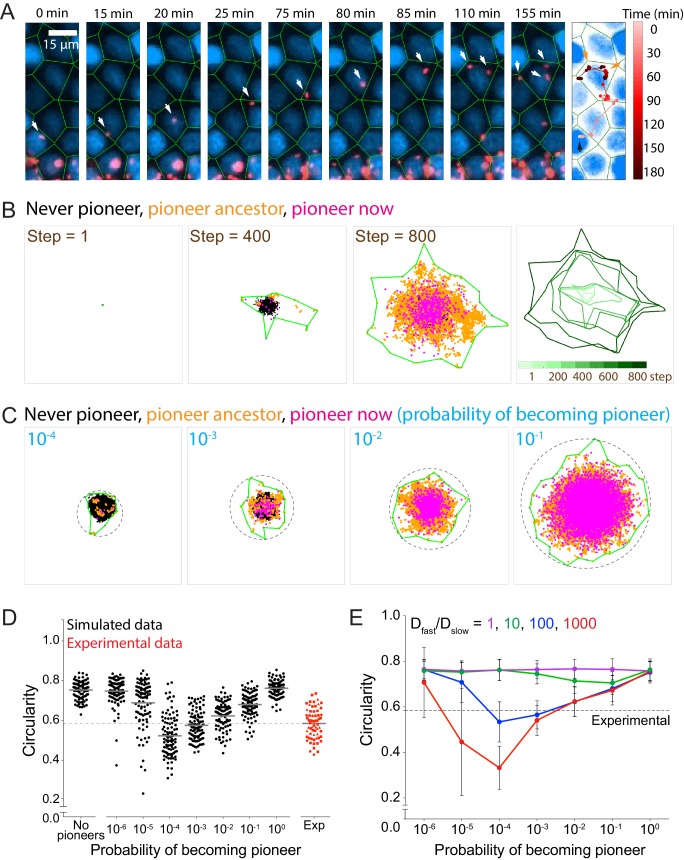
Figure 3—source data 1. This spreadsheet contains circularity data used to generate graphs in Figure 3D and E, in Figure 3—figure supplement 1B and C, and in Figure 2—figure supplement 2A and B. .
This spreadsheet also contains meansquared displacement data used to generate the graph in Figure 3—figure supplement 1A.
DOI: 10.7554/eLife.40032.020

Figure 3.

Figure 3—figure supplement 1. Allowing simulated bacteria to interconvert between pioneer and non-pioneer behavior significantly affects the circularity of the infection focus.

Figure 3—figure supplement 1.

(A) Simulated data (red) quantifying the log mean squared displacement as a function of the log of simulation steps where Dslow = 1, Dfast = 100, and P = 0.01. Dashed magenta line indicates the analytical solution for a population initially composed of non-pioneers, with probability P of becoming a pioneer at each replication event set by the growth rate k. For this expression, Davg equals the average of Dfast and Dslow weighed by P, and ∆D equals Dfast – DSlow. Blue and green dashed lines show the short time asymptotic limit (diffusive spreading with D = 1) and the long time asymptotic limit (diffusive spreading with D = Dslow*(1–P) + Dfast*P = 1.96), respectively. (B) Data quantifying the number of bacteria that either have a fast ancestor or are fast themselves as a function of probability of becoming a pioneer. Each data point represents an independent simulation. A total of 100 simulations were run per condition. Each simulation started with 25 bacteria and was run until 105 bacteria had been accumulated. Dashed line gives analytic solution: 1–(1–P)N where N is the typical number of generations in the simulation (N equals approximately 12). (C) Data quantifying the infection foci circularity as a function of number of bacteria simulated for a random walk (black) or heterogeneous spread where Dfast/Dslow = 100 and probability of becoming a pioneer is 0.10 (red). Each data point represents an independent simulation. For B and C, horizontal bars indicate the mean. For all simulations, replication rate k equals 1.
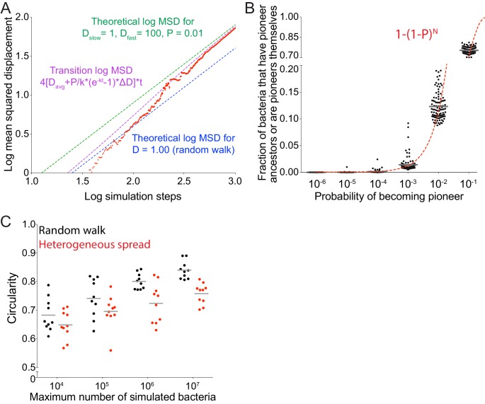
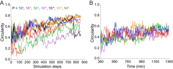
Figure 3—figure supplement 2. As time increases, focus circularity increases in both simulated and experimental data.

Figure 3—figure supplement 2.

(A) Data quantifying the circularity of simulated infection foci as a function of time. Different colors represent independent simulations with distinct values of P, the probability of the becoming a pioneer. For all simulations, replication rate k equals 1. (B) Data quantifying the circularity of experimental infection foci as a function of time. Each color represents a different focus. The effective time scales for parts A and B are comparable.