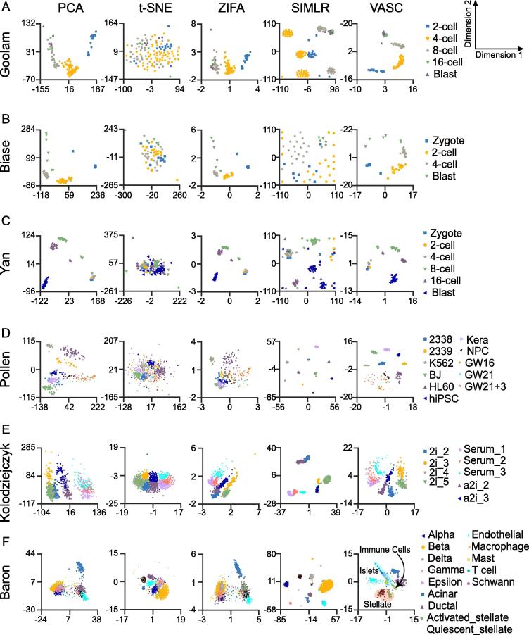
Figure 2.
Visualization of scRNA-seq datasets using different methods
Each data point represents a cell. Different cell types are indicated in different colors and shapes. All datasets were run by PCA, t-SNE, ZIFA, SIMLR, and VASC respectively. Cell type information was retrieved from original studies. Shown in the figures are clustering output from the Goolam [22] (A), Biase [18] (B), Yan [30] (C), Pollen [27] (D), Kolodziejczyk [24] (E), and Baron_human-1 [17] (F) datasets. Visualization of other datasets is provided in the Section 4 of File S1. PCA, principal components analysis; t-SNE, t-distributed stochastic neighbor embedding; ZIFA, zero-inflated factor analysis; SIMLR, single-cell interpretation via multiple kernel learning.

