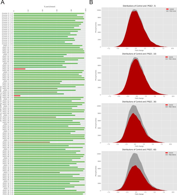
Figure 3.
(A) Bar plot of phosphopeptide enrichment analysis for each single sample. Red bars display a phosphopeptide enrichment percentage below 20%. (B) Distribution of phosphosite events plotted as a Gaussian curve area at each time-point. Stimulated samples (red) show reduction of phosphorylation respect to the control (gray) over time.

