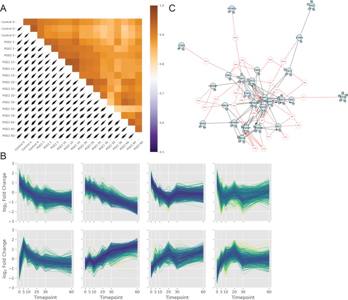
Figure 4.
(A) Correlation plot of the independent phosphoproteomics experiments shows Pearson coefficient correlation values as a heat-map. (B) Hierarchical clustering of samples across the time course experiment. Samples are z-scored along the 0-axis (y) by default. (C) PI3K/AKT network visualized in PhosphoPath using the PaDuA output containing the significant regulated phosphosites and their quantitative ratios.

