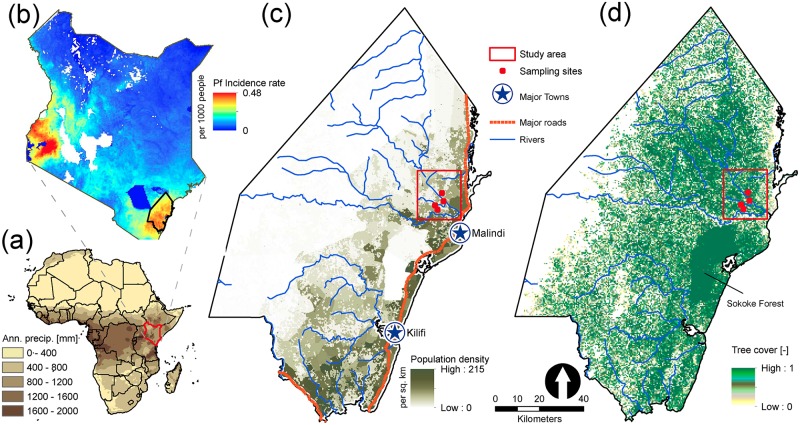
Fig 2. Map of study area in Kilifi county, Kenya.
(a) Mean annual precipitation gradient map of Africa showing Kenya in red region. (b) Distribution of P. falciparum incidence rate in Kenya. Areas that have no data are shown in white. The Kilifi county (bottom right, black polygon) is one of the regions of highest malaria incidence in Kenya. Data is obtained from the Malaria Atlas Project [54]. (c) Map of population density distribution in Kilifi county, Kenya (Data is adapted from [56]). Simulations are conducted for the area of 440 km2 indicated by the red rectangle. (d) Map of tree cover in Kilifi, Kenya. Data is obtained from the World Resource Institute (http://www.wri.org).

