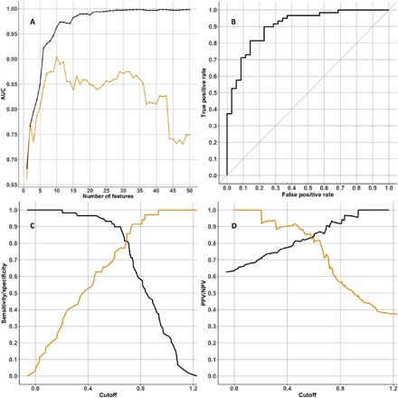
Fig. 3. Protein classifier to predict Aβ positivity that includes participants with MCI and AD.

(A) Graph showing the AUC statistic of the 50 classifier models produced using the “mixed diagnosis cohort” training dataset. The AUC when testing each classifier model in the training dataset is in black, and the AUC when testing the classifier model in the testing dataset (KARVIAH) is in orange. On the x axis is the number of features used in each classifier model. For the classifier with the best AUC in the testing dataset (this was the classifier that used 10 features; Table 6), three graphs access the classifier’s performance: (B) ROC curve, (C) sensitivity and specificity plotted in black and orange, respectively, (D) PPV and NPV plotted in black and orange, respectively.
