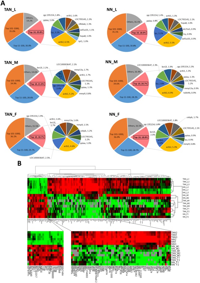
Figure 1.
Transcript abundance in neutrophils and hierarchical clustering of neutrophil samples and transcript abundance. (A) Transcript abundance distribution in neutrophil populations. The main pie charts of TAN_L, NN_L, TAN_M, NN_M, TAN_F, and NN_F are composed of four slices based on abundance ranking: top 10, 11–100, 101–1,000 and the rest (1,001 and the rest up to 12,000). Gene symbols and relative abundance of the top 10 transcripts are indicated in a subpie in each group. (B) Hierarchical clustering of the 15 neutrophil samples. The red and green colors indicate the high and low abundance, respectively.

