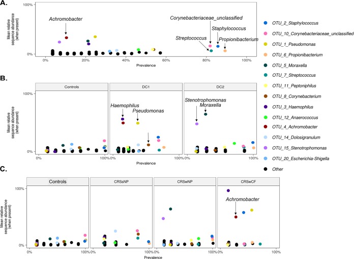
FIG 2.
Mean OTU relative abundances per sample (when present in a sample) plotted against prevalence (occurrence) across all samples (A), each DC and controls (B), and each phenotypic CRS subtype and controls (C). All OTUs are plotted. The 14 most abundant OTUs are color coded, and all other OTUs are presented as black dots.

