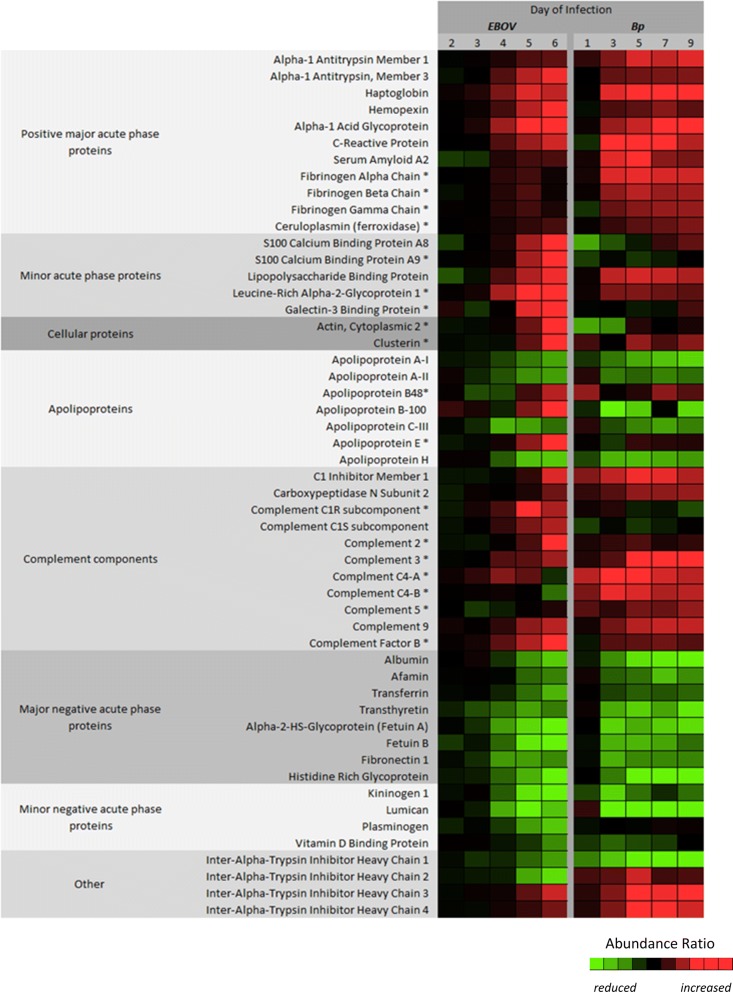
Fig. 3.
Heat map representing the protein abundance differences observed between EBOV and Bp infection. The protein abundance ratio values taken from Tables 1a/b and 2a/b were individually scaled to aid in the visualization of the protein abundance differences observed between EBOV and Bp infected plasma. This was done by assigning the lowest ratio values between the 2 sets to light green and the highest to bright red. As a result the heat map illustrates the general trending expression of each class of proteins. Proteins designated with an asterisk (*) had levels that were significantly different based on a 2-way ANOVA test between the two cohorts for at least one common post-infection time-point

