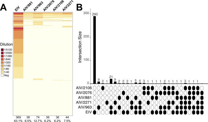
Fig 6. Individual serological results for AIVs and EIV.
A. Heat map showing the HI value for all viruses used in serological assays. Each row represents an individual horse. Each column shows the virus tested in bold, the number of seropositive samples, and the percentage of seropositive samples within brackets. HI values are color-coded according to the key, with darker colors representing higher levels of seropositivity. B. UpSet plot showing the number of seropositive horses to one or more viruses. Black and white ellipses represent seropositive and seronegative samples, respectively. Bars indicate the number of seropositive horses to each virus combination.

