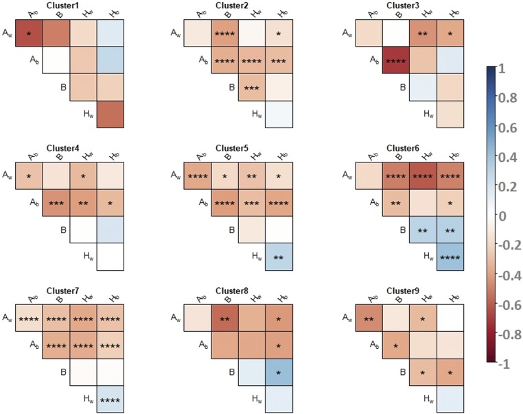
Figure 5.
Pearson’s correlation test performed to investigate the intracluster correlations on proteomic data. For each cluster, correlation between variances of the genetic effects are indicated by a color code. Red colors represent negative correlations and blue colors represent positive correlations. No symbol, not significant. * P < 0.05, ** P < 5 × 10⁻³, *** P < 5 × 10⁻⁴, **** P < 5 × 10⁻⁵.

