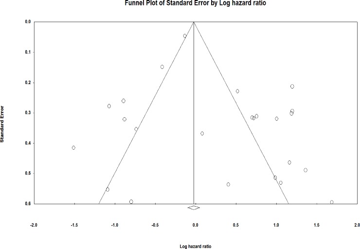
Fig 3. Funnel plot of studies correlating the overall patient survival and miRNA expression.
The funnel plot measures the study size standard error and precision on the vertical axis as a function of effect size on the horizontal axis. Dots represent the individual study and most of this area contains regions of high significance, which reveals that publication bias would be represented in the form of asymmetry. This would reflect the fact that smaller studies (which appear toward the bottom) are more likely to be published if they have larger than average effects, which makes them more likely to meet the criterion for statistical significance.

